Data visualization is a critical skill for anyone working with data. It allows you to convey complex information quickly and effectively. Pandas, a powerful data manipulation library in Python, offers robust capabilities for data visualization. This blog will walk you through the essential aspects of data visualization with Pandas using Matplotlib, providing detailed explanations and examples.
Introduction to Pandas
Pandas is a Python library designed for data manipulation and analysis. It provides data structures like Series and DataFrame, which are flexible and efficient for handling large datasets. While Pandas is primarily known for its data manipulation capabilities, it also integrates seamlessly with Matplotlib and Seaborn to offer powerful data visualization tools.
Setting Up Your Environment
Before diving into data visualization, ensure you have Pandas and Matplotlib installed. You can install these libraries using pip:
pip install pandas matplotlibOnce installed, you can import them into your Python script or Jupyter notebook:
import pandas as pd
import matplotlib.pyplot as plt
Basic Plotting with Pandas
Pandas makes it incredibly easy to create basic plots. By using the .plot() method on a DataFrame or Series, you can generate a variety of plots.
1. Line Plot
A line plot displays data points connected by straight lines. It’s useful for visualizing trends over time or continuous data.
Suppose you have a DataFrame df with a time series data:
import pandas as pd
import numpy as np
import matplotlib.pyplot as plt

# Creating a time series data
dates = pd.date_range(start='1/1/2020', periods=100)
values = np.random.randn(100).cumsum()

df = pd.DataFrame({'Date': dates, 'Value': values})
df.set_index('Date', inplace=True)

# Plotting the line plot
df.plot()
plt.title('Stock Prices Over Time')
plt.xlabel('Date')
plt.ylabel('Stock Price')
plt.show()
The output will look like,
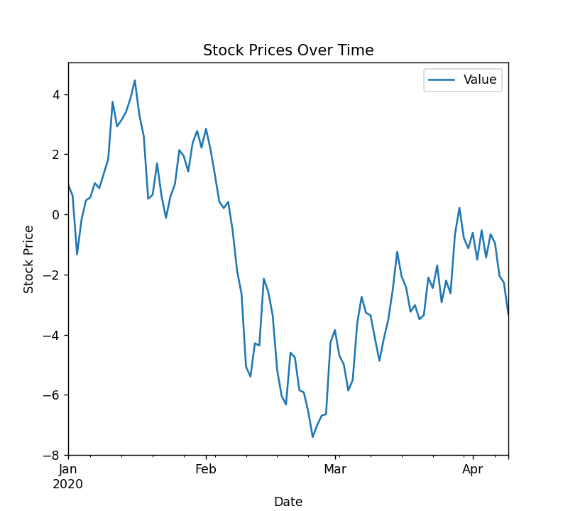
Use Case: Ideal for showing how a particular variable changes over time, such as stock prices, temperatures, or sales figures.
Example Use Case:
- Stock Price Charts: Visualizing the daily closing prices of a stock over a year.
- Temperature Trends: Showing the average monthly temperature over several years.
- Sales Figures: Displaying monthly sales data to observe seasonal trends.
2. Bar Plot
A bar plot represents categorical data with rectangular bars. The length of each bar is proportional to the value it represents, making it ideal for comparing different categories.
Here’s how you can create a bar plot:
import pandas as pd
import matplotlib.pyplot as plt

# Creating categorical data
data = {'Category': ['A', 'B', 'C', 'D'], 'Values': [23, 45, 56, 78]}
df = pd.DataFrame(data)

# Plotting the bar plot
df.plot(kind='bar', x='Category', y='Values')
plt.title('Sales per Product')
plt.xlabel('Product')
plt.ylabel('Sales')
plt.show()
Here’s what the output shows,
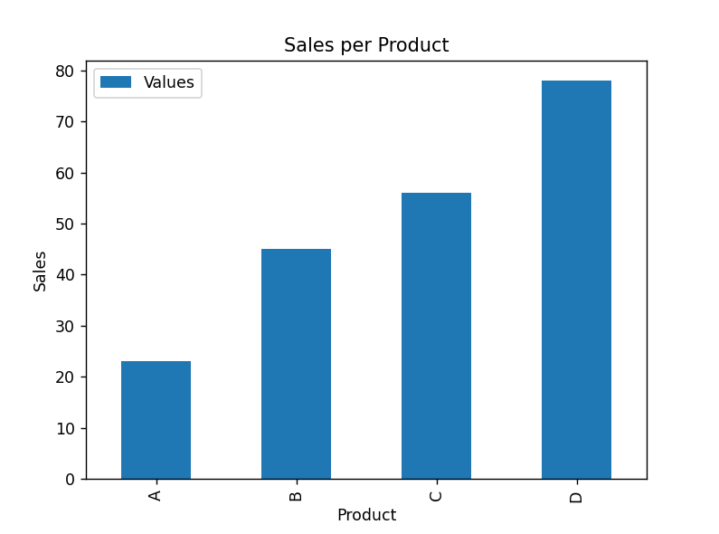
Use Case: Suitable for comparing quantities among different categories, such as sales per product, population per country, or votes per candidate.
Example Use Case:
- Sales per Product: Comparing the sales figures of different products in a store.
- Population per Country: Showing the population sizes of different countries.
- Votes per Candidate: Displaying the number of votes each candidate received in an election.
3. Histogram
A histogram shows the distribution of a numerical variable by dividing the data into bins(‘bin’ is plotted as a bar whose height corresponds to how many data points are in that bin) and displaying the frequency of data points in each bin. It’s useful for understanding the distribution and spread of data.
Here’s a code to create histogram:
import pandas as pd
import numpy as np
import matplotlib.pyplot as plt

# Generating random data
data = np.random.randn(1000)
df = pd.DataFrame(data, columns=['Values'])

# Plotting the histogram
df.plot(kind='hist', bins=30, edgecolor='black')
plt.title('Distribution of Exam Scores')
plt.xlabel('Scores')
plt.ylabel('Frequency')
plt.show()
The output will appear like this,

Use Case: Ideal for analyzing the distribution of a dataset, such as the distribution of exam scores, income levels, or ages.
Example Use Case:
- Exam Scores: Understanding the distribution of students’ scores in an exam.
- Income Levels: Analyzing the distribution of income levels within a population.
- Ages: Examining the age distribution of a customer base.
Advanced Data Visualization with Pandas
Pandas also supports more advanced plotting techniques, which can be useful for deeper insights into your data.
1. Scatter Plot
A scatter plot displays individual data points plotted on a two-dimensional plane, usually to explore the relationship between two numerical variables.
Here’s a code to create scatter plot:
import pandas as pd
import numpy as np
import matplotlib.pyplot as plt

# Generating random data
data = {'Height': np.random.randn(100) * 10 + 170, 'Weight': np.random.randn(100) * 5 + 70}
df = pd.DataFrame(data)

# Plotting the scatter plot
df.plot(kind='scatter', x='Height', y='Weight')
plt.title('Height vs Weight')
plt.xlabel('Height (cm)')
plt.ylabel('Weight (kg)')
plt.show()
The output will look like this,
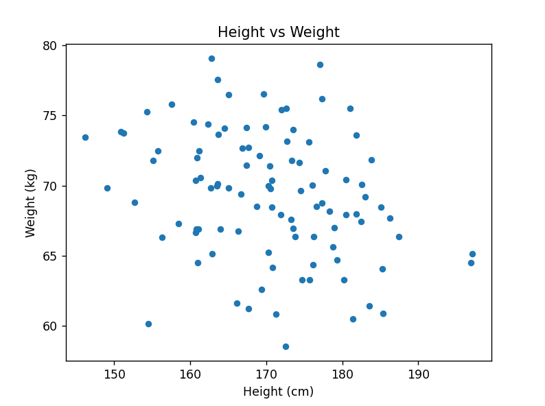
Use Case: Useful for identifying correlations, patterns, or outliers in data, such as the relationship between height and weight, income and expenditure, or age and cholesterol levels.
Example Use Case:
- Height vs. Weight: Investigating the relationship between individuals’ heights and weights.
- Income vs. Expenditure: Exploring how income affects spending habits.
- Age vs. Cholesterol Levels: Studying the correlation between age and cholesterol levels in a health survey.
2. Box Plot
Description: A box plot summarizes the distribution of a dataset by showing its minimum, first quartile, median, third quartile, and maximum values. It helps identify outliers and the overall spread of the data.
Here’s a code to create a box plot:
import pandas as pd
import numpy as np
import matplotlib.pyplot as plt

# Generating random data
data = [np.random.randn(100) for _ in range(4)]
df = pd.DataFrame(data).T
df.columns = ['Class A', 'Class B', 'Class C', 'Class D']

# Plotting the box plot
df.plot(kind='box')
plt.title('Test Scores Distribution Across Classes')
plt.ylabel('Scores')
plt.show()
The output will appear like this,
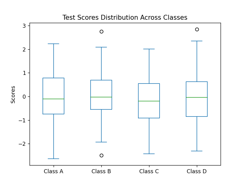
Use Case: Ideal for comparing distributions across different groups, such as test scores across different classes, annual incomes across different regions, or patient ages across different hospitals.
Example Use Case:
- Test Scores Across Classes: Comparing the distribution of test scores among different classes.
- Annual Incomes Across Regions: Analyzing the distribution of incomes in various regions.
- Patient Ages Across Hospitals: Examining the age distribution of patients in different hospitals.
3. Area Plot
Description: An area plot is similar to a line plot but with the area below the line filled. It shows how quantitative values change over time, emphasizing the magnitude of changes.
Here’s how we create a area plot:
import pandas as pd
import numpy as np
import matplotlib.pyplot as plt

# Generating random cumulative data
dates = pd.date_range(start='1/1/2020', periods=100)
values = np.random.randn(100, 3).cumsum(axis=0)
df = pd.DataFrame(values, index=dates, columns=['Product A', 'Product B', 'Product C'])

# Plotting the line plot
df.plot(kind='line')
plt.title('Cumulative Sales Over Time')
plt.xlabel('Date')
plt.ylabel('Cumulative Sales')
plt.show()
The output will appear like this,
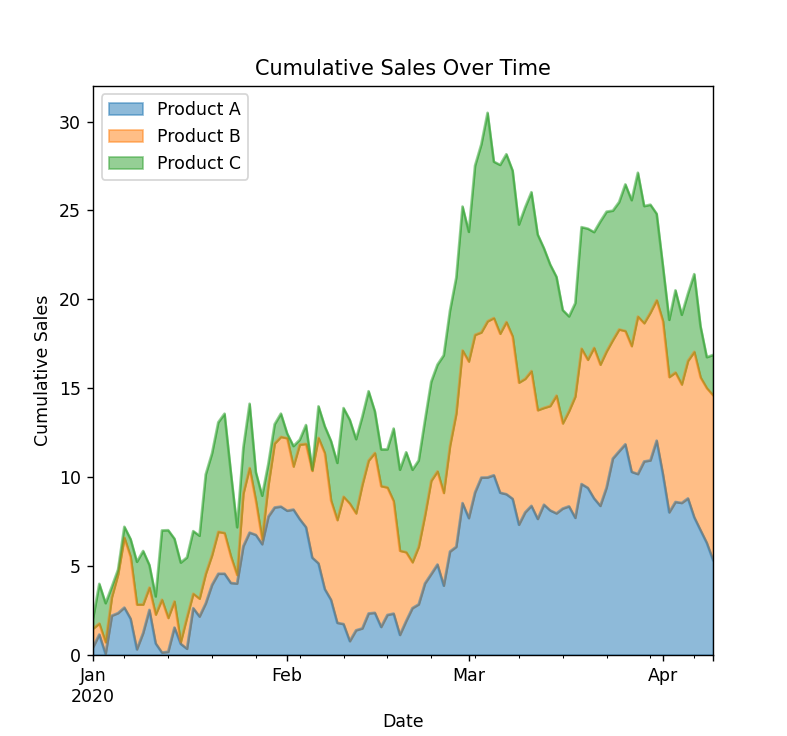
Use Case: Suitable for visualizing cumulative data, such as the total revenue over time, the growth of a population, or cumulative sales.
Example Use Case:
- Cumulative Sales Over Time: Displaying the total sales accumulated over a period.
- Population Growth: Showing the growth of a population over several decades.
- Revenue Over Time: Visualizing the cumulative revenue generated over time.
Customizing Plots
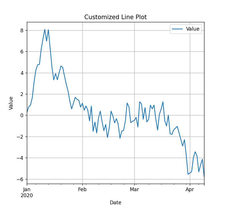
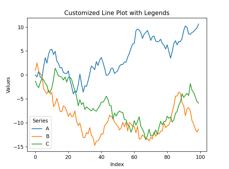
Pandas plots can be customized using Matplotlib functions. You can adjust titles, labels, legends, and more.
Adding Titles and Labels
df = pd.DataFrame({
    'Date': pd.date_range(start='1/1/2020', periods=100),
    'Value': np.random.randn(100).cumsum()
})
df.set_index('Date', inplace=True)
df.plot()
plt.title('Customized Line Plot')
plt.xlabel('Date')
plt.ylabel('Value')
plt.grid(True)
plt.show()
Output:
Legends and Colors
df = pd.DataFrame({
    'A': np.random.randn(100).cumsum(),
    'B': np.random.randn(100).cumsum(),
    'C': np.random.randn(100).cumsum()
})
df.plot()
plt.title('Customized Line Plot with Legends')
plt.xlabel('Index')
plt.ylabel('Values')
plt.legend(title='Series')
plt.show()
Output:
Subplots
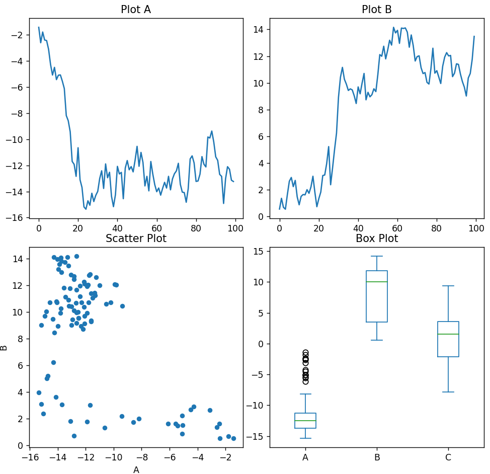
Creating subplots can help visualize multiple plots in a single figure:
import pandas as pd
import numpy as np
import matplotlib.pyplot as plt

df = pd.DataFrame({
    'A': np.random.randn(100).cumsum(),
    'B': np.random.randn(100).cumsum(),
    'C': np.random.randn(100).cumsum()
})
fig, axs = plt.subplots(2, 2, figsize=(10, 10))

df['A'] = np.random.randn(100).cumsum()
df['B'] = np.random.randn(100).cumsum()

df['A'].plot(ax=axs[0, 0], title='Plot A')
df['B'].plot(ax=axs[0, 1], title='Plot B')

df.plot(kind='scatter', x='A', y='B', ax=axs[1, 0], title='Scatter Plot')
df.plot(kind='box', ax=axs[1, 1], title='Box Plot')

plt.tight_layout()
plt.show()
Output:
Conclusion
Data visualization with Pandas is a powerful tool for data analysts and scientists. By leveraging Pandas’ plotting capabilities, you can quickly generate insightful visualizations that help you understand and communicate your data effectively. Whether you’re creating simple line plots or complex subplots, Pandas integrates seamlessly with Matplotlib to offer a wide range of customization options.
By following this guide, you should be well on your way to mastering data visualization with Pandas. Happy plotting!
Also Explore: